A good friend of mine came to me with a logo project for a new online business he was starting with a partner. He had a business naRGB vs. CMYK (and the Hex): Why Your Colors Look Muddy When You Printme and a specific green color he wanted to use. I took his green and tried to find a close match that could be reproduced as a CMYK mix. I knew that one day he'd need to print that logo somewhere, and he would not be happy if the colors didn't match.
I presented the logo with my recommended color. While they were thrilled with the design, they were not pleased with the green I chose. They had given me a hex code and demanded I use that exact color. No explanation on my part would do. Instead of ruining a friendship, I caved to their demands and provided them with the RGB files they needed for their website.
Months later, my friend handed me one of his new business cards. There was his logo. The bright chartreuse green had turned into a flat toad green. He understood, then, what I had been trying to tell him all along. In his case, he was okay with the toad green as long as the website glowed. But most people aren't that forgiving.
If you've ever been confused or frustrated about why your printed materials don't match what you see on screen, here's what you need to know.
The Core Problem: Screen Colors Don't Equal Print Colors
Those gorgeous, vibrant colors on your computer screen? Many of them simply can't be printed. It's not that your printer is broken or your designer is incompetent. It's just how light and ink work differently.
Screens and printers create color in fundamentally different ways, and understanding that difference will save you from toad green business cards.
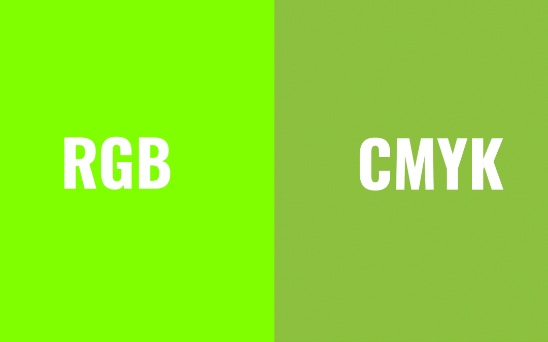
RGB: How Screens Make Color
RGB stands for Red, Green, and Blue. Your computer monitor, phone, and TV create colors by emitting light in different combinations of these three colors. This is called additive color. The more light you add, the brighter it gets. Combine all three at full intensity, and you get white.
Because RGB uses light, it can produce incredibly bright, vivid colors. Electric greens, hot pinks, glowing oranges. It's why that chartreuse looks so good on your website.
CMYK: How Printers Make Color
CMYK stands for Cyan, Magenta, Yellow, and Black. The K stands for key, which refers to black. Printers create color by layering ink on paper. This is called subtractive color. The more ink you add, the more light gets absorbed, and the darker the result becomes.
Here's the key difference: ink can't glow. It can only reflect the light that hits it. So while RGB can create those eye-popping neons by emitting light directly into your eyes, CMYK is limited to what can be achieved by reflecting ambient light off paper and ink.
Why additive and subtractive?
RGB is additive because screens emit light. The more colors you combine, the brighter it gets. Red plus green plus blue equals white. CMYK is subtractive because the inks absorb light. The more ink you layer on paper, the less light reflects back to your eye, making it darker.
What About Hex Codes?
If you've ever been given a color as something like #7FFF00 (that chartreuse I mentioned), that's a hex code. Hex codes are just another way of writing RGB colors.
Those six characters break down like this:
- First two = red value
- Middle two = green value
- Last two = blue value
Since hex codes are just RGB in disguise, they have the same limitation. They describe light-based colors that often can't be reproduced with ink. So when you send your designer a hex code and ask them to match it in print, you're asking for something that might be physically impossible.
The Reality Check
Some colors simply cannot be reproduced with standard CMYK printing. Especially bright greens, oranges, blues, and anything neon. The color range (or gamut) of RGB is much wider than what CMYK can handle.
This is why:
- That electric lime green turns muddy olive
- That hot pink becomes dull mauve
- That brilliant cyan looks washed out
Your printer isn't doing it wrong. The color just doesn't exist in the CMYK world.
What You Can Do
If you're choosing colors for a brand or project that will be printed:
Choose with printing in mind. If you know you'll need business cards, brochures, or signage, pick colors that can actually be printed. A good designer can help you find colors that work in both RGB and CMYK.
Ask for a printed proof. Before committing to thousands of business cards or a big print run, ask to see a physical sample. What looks great on your monitor might disappoint you on paper.
Consider spot colors for critical branding. If color accuracy is really important (like for a well-established brand), ask your printer about Pantone or other spot color systems. These use premixed inks rather than CMYK combinations and can hit colors CMYK can't. They're more expensive, but sometimes worth it.
Understand that close might be the best you'll get. If you've already fallen in love with an RGB color, your designer will do their best to find the closest CMYK match. But it won't be exact, and that's okay.
A Note for New Designers
Always convert your designs to CMYK and show clients a soft proof or, better yet, a printed sample before they fall in love with a color that won't reproduce well. It's much easier to manage expectations early than to explain why their printed materials look wrong after the fact.
Most design software (Photoshop, Illustrator, InDesign) lets you preview how RGB colors will convert to CMYK. Use that feature. It'll save you a lot of headaches and maybe a friendship or two.
The Bottom Line
Screens use light. Printers use ink. They create color differently, so they can't always produce the same results.
If you understand this going in, you'll make better color choices, set realistic expectations, and avoid the disappointment of toad green business cards. And if your website needs to glow? That's fine. Just know that the printed version might need to be a little more subdued.